
Most content doesn’t fail because of bad ideas. It fails because the presentation doesn’t support the intention behind it.
That’s something Thiago Aragão, Creative Director at Gradient and one of the leaders behind MSP Studio+, has spent years refining. Working closely with marketing and product teams, he’s helped shape how strong ideas translate into clear, high-performing visual communication.
His perspective is straightforward. Design isn’t about making things look better. It’s about making decisions clearer.
MSP Studio+ was built around that principle. Not to offer more design options, but to provide the right structures so each message does exactly what it’s meant to do.
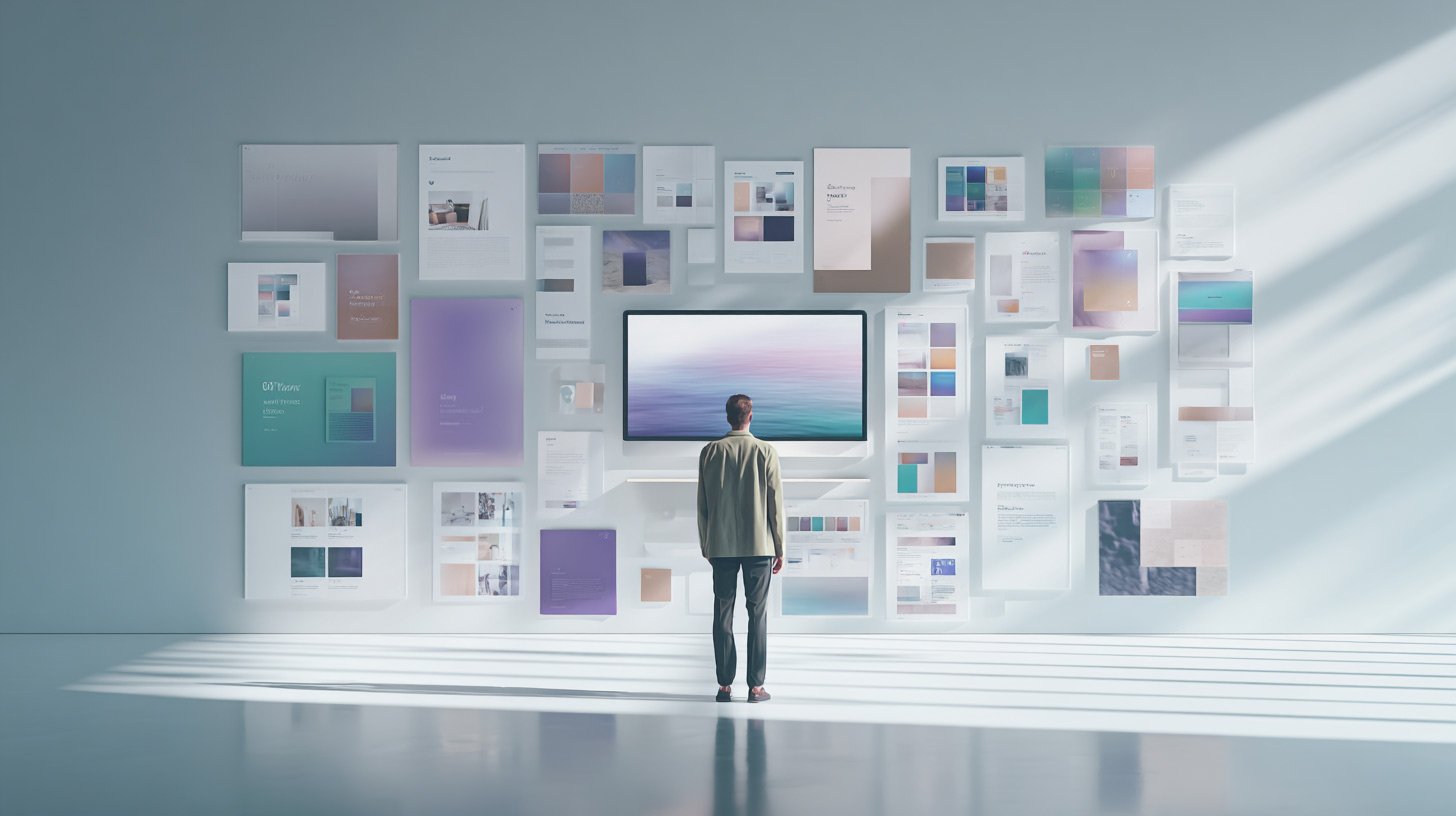
The six layouts below reflect that thinking. Each one exists to solve a specific communication problem. When used intentionally, they remove guesswork and allow design to do what it should from the start: carry the message.
Match the layout to the goal
Centered Hero Banner

Best for: educational posts, webinars, announcements that need clarity first
This is your safest, most reliable starting point. Everything is anchored and symmetrical, which makes it easy to scan and easy to trust.
Use this when:
- You are teaching something
- You are inviting people to an event
- You want zero friction in understanding the message
It works because it removes decision fatigue. The reader doesn’t have to figure out where to look. Title, supporting line, and CTA are all exactly where they expect.
If you’re ever unsure which direction to go, this is your default.
Left-Aligned Editorial

Best for: thought leadership, opinions, strategic insights
This layout signals confidence.
The left alignment introduces asymmetry in a controlled way, which feels more editorial and less “template-driven.” It’s the kind of structure people associate with premium brands like Apple or Notion.
Use this when:
- You are sharing a perspective
- You want to position your brand as an authority
- The content is more about ideas than announcements
It works because it feels intentional. It tells the reader this isn’t just information, it’s a point of view.
Framing Text + Space

Best for: product announcements, feature launches
This layout uses space as a design element. Instead of adding more components, it creates hierarchy through restraint.
Use this when:
- You are introducing something new
- You want the message to feel considered and polished
- You need clarity without clutter
It works because it feels “designed” without trying too hard. The framing effect naturally guides attention while keeping the overall composition calm.
You get structure without visual noise.
Highlight Card Style

Best for: tips, stats, quick wins, single insights
This is where you turn small pieces of information into something that feels valuable.
The floating card becomes the focal point, making even one stat or idea feel like a deliverable.
Use this when:
- You have one key takeaway
- You’re sharing bite-sized value
- You want something highly scannable
It works because it isolates importance. Instead of competing with other elements, the content sits inside a container that says “this matters.”
Great for social content where attention is limited.
Glowing Stack Layout

Best for: promotions, offers, structured messaging
This layout creates a strong vertical flow. Each section builds on the one above it, guiding the reader down the page naturally.
Use this when:
- You are presenting an offer
- You need to walk through multiple points
- You want momentum in the reading experience
It works because it organizes complexity without adding visual clutter. The stacking effect keeps things moving while still feeling clean and structured.
You don’t need extra design tricks. The layout does the work.
Editorial Cartoon

Best for: personality-led content, storytelling, brand voice
This is your most expressive option.
Overlapping text blocks and asymmetric balance create a playful but still credible feel. It’s informal without being messy.
Use this when:
- You want to show personality
- You’re telling a story or sharing an opinion in a lighter tone
- You want to stand out in a feed
It works because it feels human. The slight imperfection in the layout signals authenticity, which builds trust in a different way than polished symmetry.
The bigger shift
Most teams try to standardize design. What actually scales better is standardizing decisions.
Instead of reinventing layouts every time, you choose the one that matches the job:
- Clarity → Centered Hero
- Authority → Left-Aligned Editorial
- Announcement → Framing Text
- Quick value → Highlight Card
- Conversion flow → Glowing Stack
- Personality → Editorial Cartoon
When you do that consistently, your content starts to feel cohesive without looking repetitive.
And more importantly, it starts to perform with intent.